IDENTITY SYSTEM FOR A NEW PUBLICATION
Outside Inc
C A S E S T U D Y
Start-Up MTB Publication
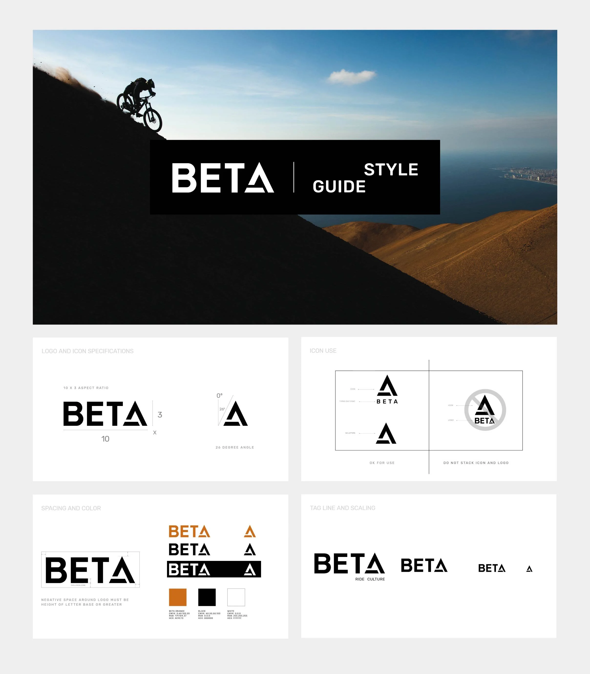
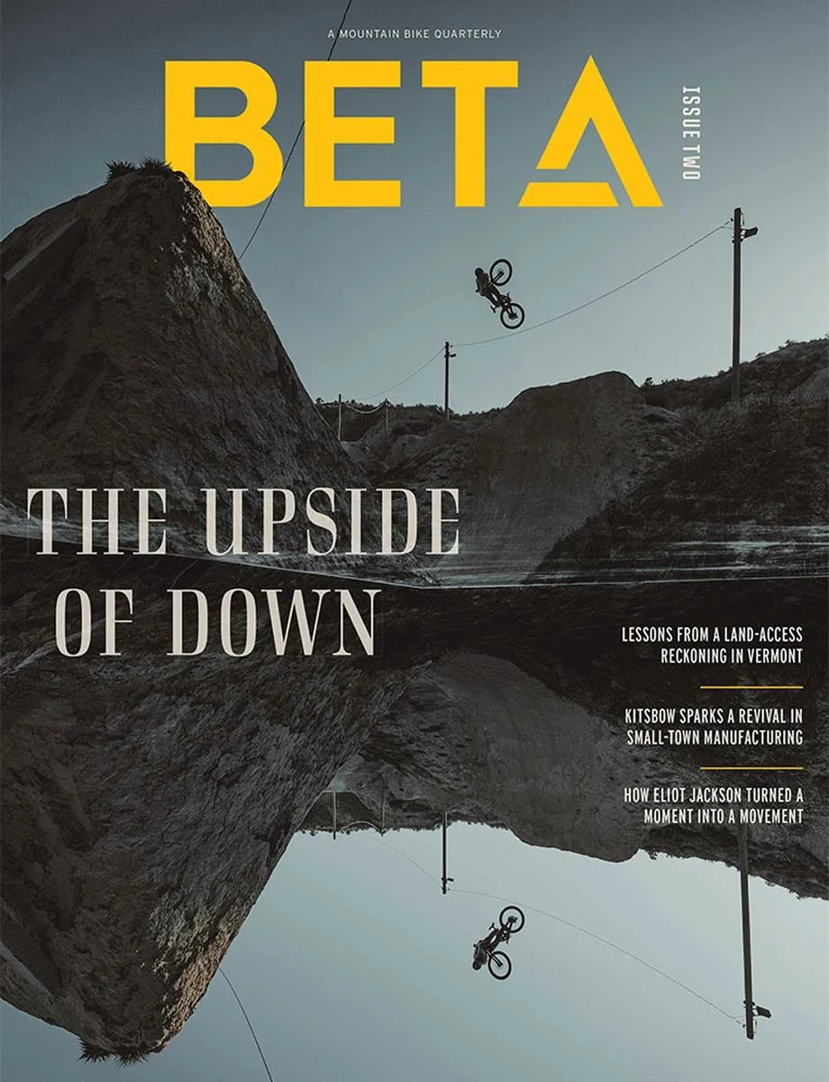
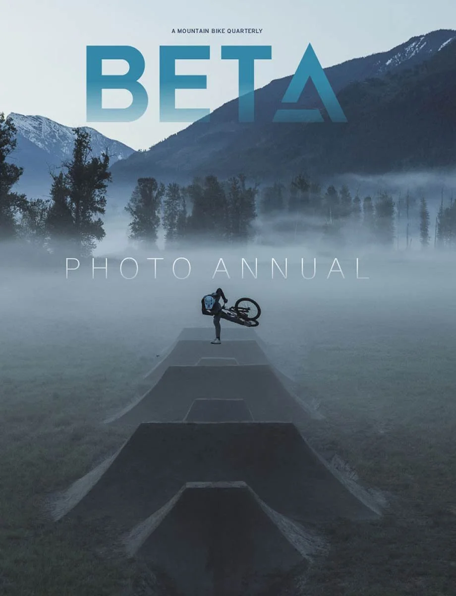
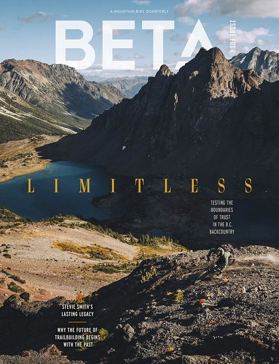
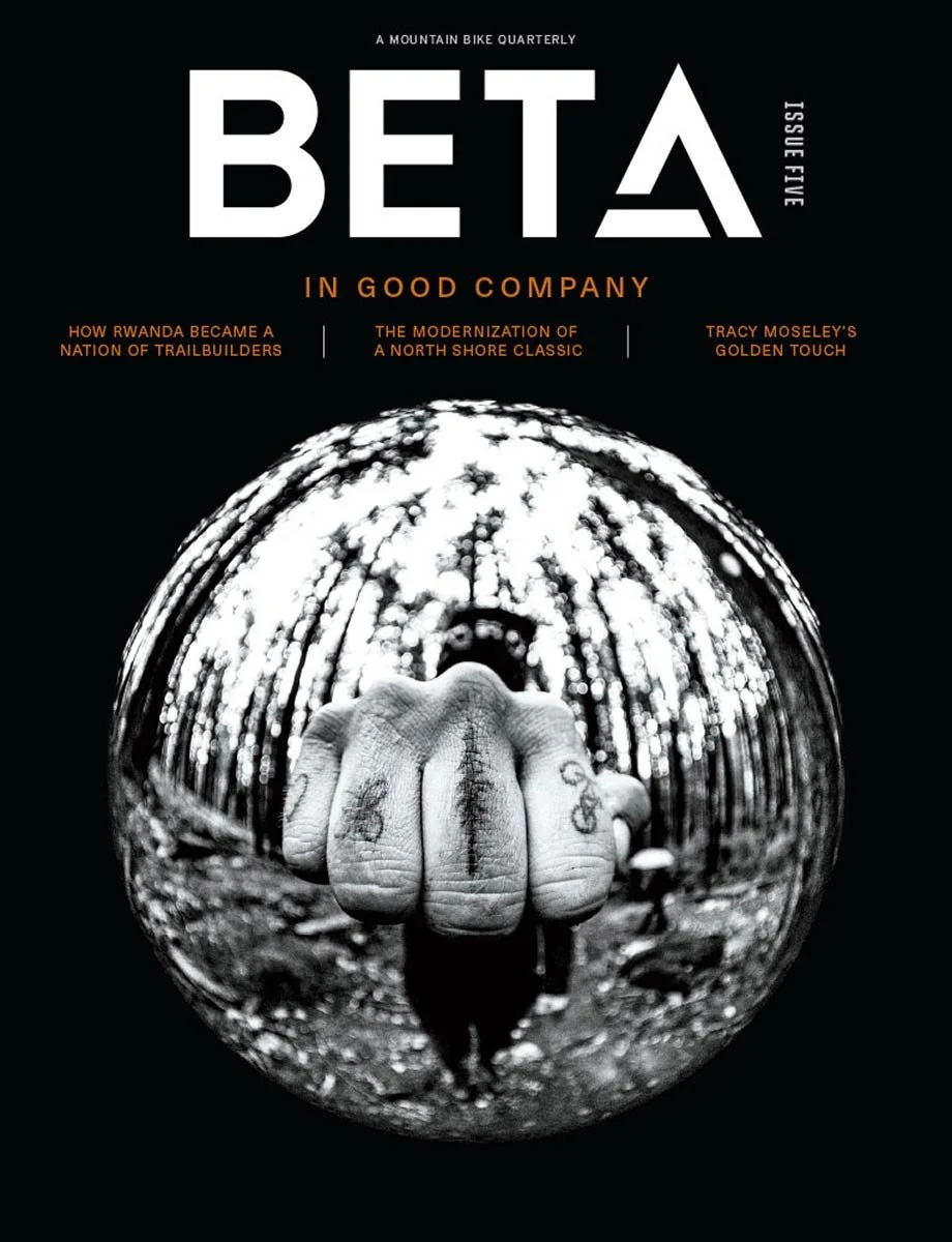
A full brand identity and creative direction project for BETA MTB, an all-new mountain bike publication launched under Outside. The project included art direction systems for print, digital, social, and motion content designed to establish the brand from the ground up.
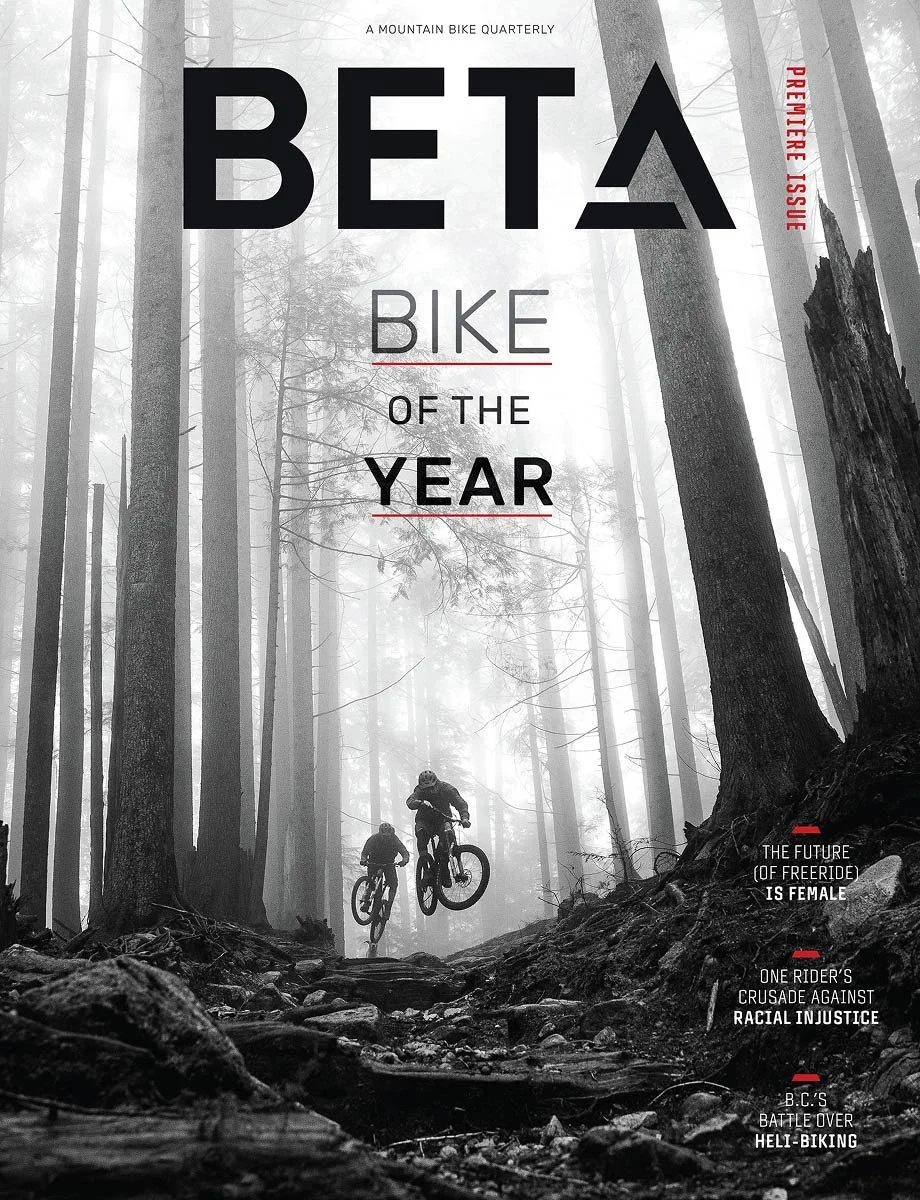
An all-new mountain bike publication built from the ground up for the modern MTB audience.
The Idea
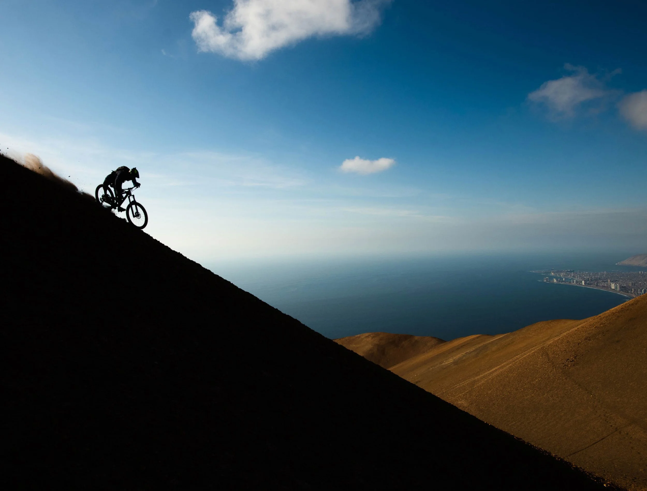
Mountain biking is too big a sport to serve one discipline. BETA wasn't built for downhill riders or gravel crossover riders specifically — it was built for the feeling underneath all of it: total dedication to the ride, freedom over category. That "it's about the ride" feeling had to come through in the design itself, not just the editorial voice.
The other tension: mountain bike media already has deeply established players and a highly opinionated audience. A new publication had to feel instantly credible to riders who've read this space for years — without just imitating what already existed, and without chasing a trend-of-the-month look that would date itself in a year.
The Opportunity
"Legacy feel" didn't mean old — it meant durable. The goal was a look that would hold up as well in 20 years as it did on day one: clean, big photography, design that supported the sport and the imagery instead of competing with it. No trend-chasing, no flavor-of-the-month styling — authority built through restraint.
"Modern" wasn't a break from that legacy feel — it was legacy design with every dated trend stripped out. Take the best of what's always worked in outdoor editorial, clean it up, and lose everything that was only ever fashionable for a season.
Issue Trailers
Bringing It to Life
Over a roughly four-month build, we worked closely with BETA's editorial team to shape the full look and feel across every format the brand would live in — print, web, video, and social — before a single issue shipped.
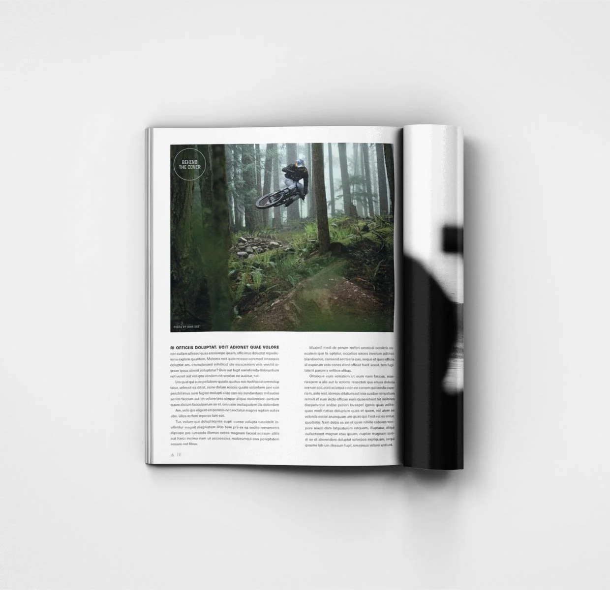
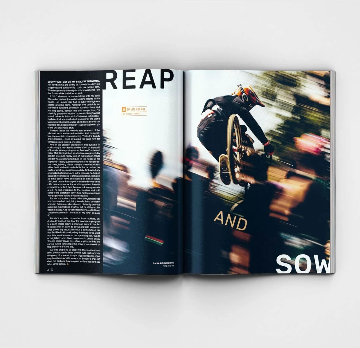
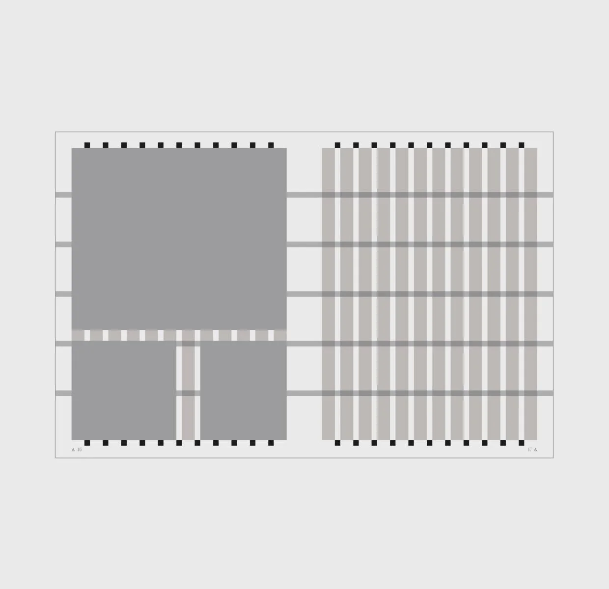
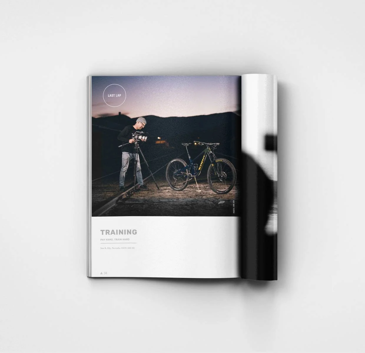
That meant full mockups of an entire look-book magazine, including department pages and feature story templates, so the editorial team had a real system to publish into from issue one. Video got the same treatment: intros, outros, lower thirds, an animated BETA logo, and a broader animation language for ongoing series. The website carried its own constraint — built inside Outside's existing site template — so custom fonts, colors, logos, and art direction had to be layered in to make BETA feel like its own brand while still living inside that framework.
What Was Created
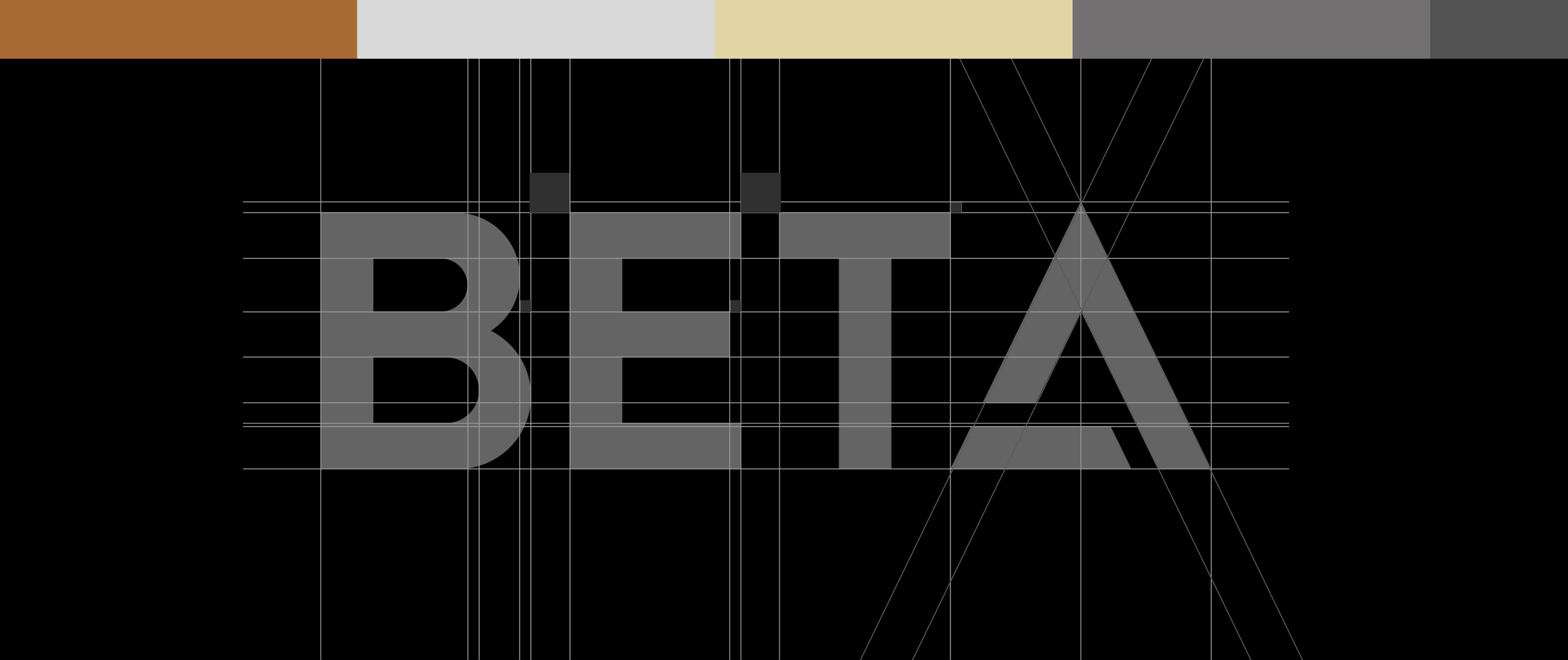
Full brand identity system
Print magazine mockups, including department and feature templates
Website design direction within Outside's platform template
Social media rollout
Motion graphics and animation language, including intros, outros, lower thirds, and an animated logo
Long-term visual playbooks for internal teams and ongoing publication growth
Why It Works
A new publication doesn't get to build its identity issue by issue — it has to arrive with the whole system already working, on day one, across formats that don't normally share a design language. Building the full playbook — print, web, video, social — before launch meant BETA's editorial team had a real system to publish into immediately, not a style to figure out as they went.
BETA launched with a cohesive identity across every platform it lived on, balancing an established, authoritative feel with a modern execution — proof that "credible" and "new" aren't actually in conflict, if the system is built right from the start.